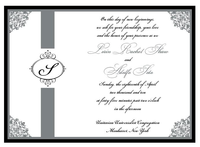
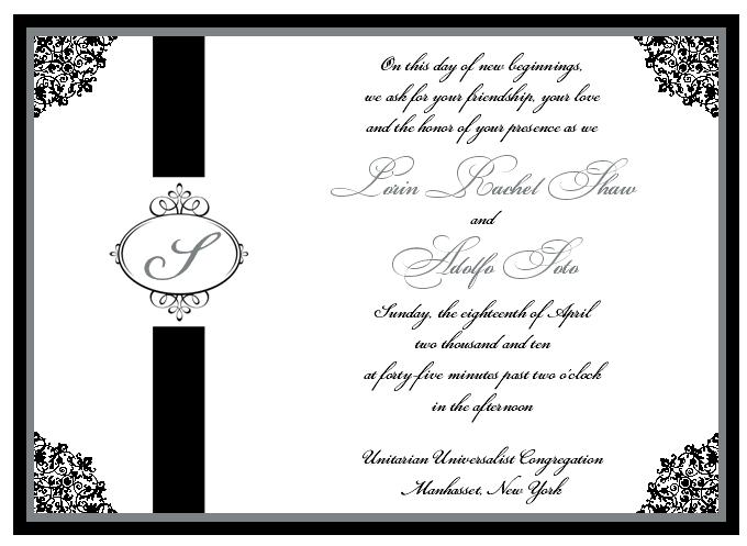
Need your help!!!! So here are 2 designs. Yes, I realize that she has forgotten an important line after our names, lol which I will tell her.
'are united in marriage'
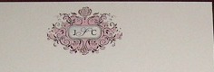
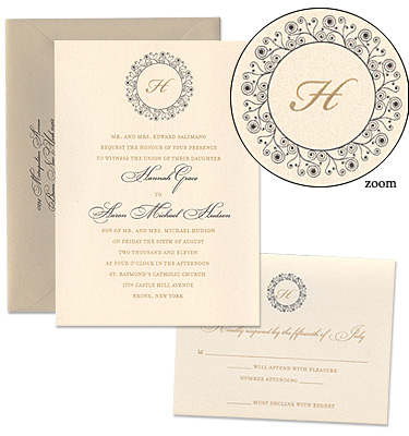
But i need your help on the colors and monogram part. First thing is, fh doesnt like the two thick lines on top and bottom of the monogram so I will ask her to make that graphic larger to fill the space but I also think I want a differerent graphic around the initial. I am attaching two here that I like, what do you think, #1 (the one with pink but the pink areas would be platinum) or #2 the circle one. Also, I dont like that the 'S' is pretty unrecognizalbe because of the font so I think I want a non-cursive one or another font that you can distinguish it better.
Now, colors wise, what do you think? Where do you like platinum to be and where do you like black to be? I told her that I wanted a good deal of platinum since Im not customizing a whole lot and the main places that color scheme of black and platinum will show is the bm dresses, tuxes and invites. so what do you think?
but you said you want more platinum, so I don't know!
maybe do it like #2 but the vertical line thing w/the S in the middle, make that Platinum also i think and the S in black...follow??
and DEFINITELY change the font of the S, i had no idea it was an S
depoc1011
Posted:
Member since
Re: Invites with pics, help!!!
i like the fonts with your names but i feel your names do not stand out...
i agree with you on the S...
ok i was feeling like there was perhaps a little something missing...maybe, you could add some crystals to the design???
I think they are really pretty!
I am sorry if i am not much help! xo
Jna2010
Posted:
Member since
Re: Invites with pics, help!!!
color wise i like #2 better
monogram wise i like the one you have on th einvite but agree with you about the 's', i just think the other ones are too much with the corners of the invite
there only one thing that i thinkmight need tweaking, its the two lines leading to the monogram, theyre very thick and then just cut off where the monogram is, i wish it flowed a bit more
but overall i think theyre very pretty!
soontobecruz
Posted:
Member since
Re: Invites with pics, help!!!
ahhh they are soo pretty!!
I like #1 better. Also the thick lines, arn't they a ribbon? And the ribbon is like under where the monogam is. like it's threaded though (I can't think of what it would really be called)
I agree with you on the font of the 'S'. I would go with a less script one, or one where the 'S' looks like an 'S'
Of your second 2 monogran designs I like the pink one a lot. I am not to big a fan of the circle one.
They are really pretty and elegent!! YAY!!
MrsSoto
Posted:
Member since
Re: Invites with PICS, help!!!
thanks guys!
keep the suggestions comin
MC127
Posted:
Member since
Re: Invites with PICS, help!!!
I Love #2. Btw, your invites look similar to mine. I never thought of placing a design on the corners and it looks nice.
stinenandy2010
Posted:
Member since
Re: Invites with PICS, help!!!
i love #2
grkbarbie
Posted:
Member since
Re: Invites with PICS, help!!!
i like the 1st one.. the pink 1 looks like an important document, not an invite.
mosh424
Posted:
Member since
Re: Invites with PICS, help!!!
Posted by stinenandy2010
i love #2
Same here
GinaMike24
Posted:
Member since
Re: Invites with PICS, help!!!
I really like #1
chrisandletizia
Posted:
Member since
Re: Invites with PICS, help!!!
love the silver
soooo pretty nice choice :)
Lsorrent
Posted:
Member since
Re: Invites with PICS, help!!!
I like number 1 better
20mrsc10
Posted:
Member since
Re: Invites with PICS, help!!!
i like number 2..but if the lines aren't ribbon, are they just going to be printed on?
MrsSoto
Posted:
Member since
Re: Invites with PICS, help!!!
Posted by 20mrsc10
i like number 2..but if the lines aren't ribbon, are they just going to be printed on?
yeah...a little funny i thought. im not sure how i feel about those lines and fh definately doesnt like them
GiannisWifey
Posted:
Member since
Re: Invites with PICS, help!!!
I like #1 better - I am not sure why but I feel like the silver looks richer?
mariedsgn
Posted:
Member since
Re: Invites with PICS, help!!!
I like #1 Better - Are the thick lines a ribbon? I think you need to change the font of the S
Clover23
Posted:
Member since
Re: Invites with PICS, help!!!
I like #1 better - if it's not a ribbon, why don't you make it a ribbon?
And I say Yes to changing the 'S'
AandA2010
Posted:
Member since
Re: Invites with PICS, help!!!
Def # 1.. And agree with everyone on the S it should look like an S. If the thick lines are not ribbon see if they can make then something else or make it ribbon. Both are very nice!!!!!!
christine2010
Posted:
Member since
Re: Invites with PICS, help!!!
i love # 2. but as others mentioned think that the 's' font should be changed.