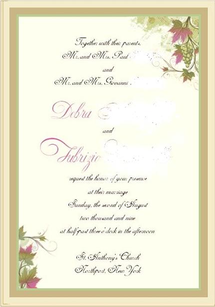
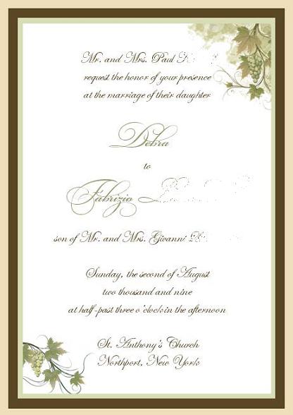
Here is a mockup of my invitation by TESSA. I am having a summer wedding so I need some color on the invitation (in my opinion). Do you think the pink names and pink on the leaves clashes or do you think it flows nicely? Or do you like the all neutral invitation (#2)? Any other suggestions?
We are not looking at the wording or anything. Just the design and colors. TIA!!!
I would leave it as is. It looks great!! I like how the pink matches the leaves..
Bride908
Posted:
Member since
Re: My invitation by Tessa
I like the first one. The color looks nice.
futuremrsfab
Posted:
Member since
Re: My invitation by Tessa
I personally like the all neutral one- the one that has the pink looks like fall to me because the leaves are half green/half pink- jmo
lucamon
Posted:
Member since
Re: My invitation by Tessa
I like the 2nd one if you can add the pink/ plum color to the grapes instead of the leaves that would be better. I agree with the above poster, the pink leaves make it look like a fall wedding.
lucamon
Posted:
Member since
Re: My invitation by Tessa
Posted by lucamon
I like the 2nd one if you can add the pink/ plum color to the grapes instead of the leaves that would be better. I agree with the above poster, the pink leaves make it look like a fall wedding.
This is a too cartoony but you get the idea. Green leaves, purple grapes.