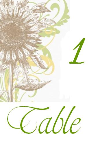
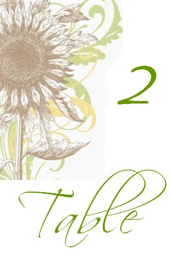
So here is what I have for our table numbers (though this may change but I don't think so).
Which font do you girls think looks better?
Also, in general, is there anything you think looks werid or that I should change about it?
TIA!
DWKSwed
Posted:
Member since
Re: Opinions on Table Numbers
The only thing I don't like is that is reads '1 Table' instead of 'Table 1'... to me that just looks weird. I would take out table entirely and design it around the number, or design it so that 'Table' can go on top. JMO, love the idea!!
mrsq2be
Posted:
Member since
Re: Opinions on Table Numbers
I like both but i chose #1 b/c its more bold. I agree with other people and maybe make the table numbers bigger. Are you printing these yourself? do you have the pattern already on the card?
WeezyGirl2354
Posted:
Member since
Re: Opinions on Table Numbers
I'm going with 1 and going with what everyone else said and make the number bigger but I'm gonna throw in: maybe change the color?
I like it being green and I guess it could just be my monitor but it seems a bit bright to me.
Also - maybe take out the word table? If it's on the table people know it's a table, right? Instead maybe put your names or wedding date?? some kind of monogram??
FutureJOC
Posted:
Member since
Re: Opinions on Table Numbers
Posted by mrsq2be
I like both but i chose #1 b/c its more bold. I agree with other people and maybe make the table numbers bigger. Are you printing these yourself? do you have the pattern already on the card?
I am going to be printing these myself and framing them. There is going to be no pattern on the card.
Weezy - I like the idea of possibly using the monogram. I will play around with it some more today.
And I agree with you girls that 'table' should be taken out completely.
Well, I'm off to work on more options! Yeay for the boss not being here today
Neeks
Posted:
Member since
Re: Opinions on Table Numbers
I like number 1
suzie411
Posted:
Member since
Re: Opinions on Table Numbers
i like #2. . .fancy fancy
allornil
Posted:
Member since
Re: Opinions on Table Numbers
you do know that once I'm ready to do mine , I'm conning you into doing them for me right? lol
FutureJOC
Posted:
Member since
Re: Opinions on Table Numbers
Posted by allornil
you do know that once I'm ready to do mine , I'm conning you into doing them for me right? lol
LOL no problem... I seriously enjoy doing stuff like this
FutureJOC
Posted:
Member since
Re: Opinions on Table Numbers
Ok another option (thank to Weezy )
I added the monogram on the bottom of this one and made the number bigger.
Now, the only thing I want to mention is that I am also using our monogram on the top of our menus so I don't want it to look like overkill to use them on the table numbers as well... although I may just be looking too much into it and it really doesn't matter, but I will let you girls decide that LOL
So let me know what you think of this one.
EDIT: I should also mentioned these will be in 5x7, possibly black frames.
I added the monogram on the bottom of this one and made the number bigger.
Now, the only thing I want to mention is that I am also using our monogram on the top of our menus so I don't want it to look like overkill to use them on the table numbers as well... although I may just be looking too much into it and it really doesn't matter, but I will let you girls decide that LOL
So let me know what you think of this one.
EDIT: I should also mentioned these will be in 5x7, possibly black frames.
I LOVE this one!
halfbaked
Posted:
Member since
Re: Opinions on Table Numbers
Posted by FutureJOC
Ok another option (thank to Weezy )
I added the monogram on the bottom of this one and made the number bigger.
Now, the only thing I want to mention is that I am also using our monogram on the top of our menus so I don't want it to look like overkill to use them on the table numbers as well... although I may just be looking too much into it and it really doesn't matter, but I will let you girls decide that LOL
So let me know what you think of this one.
EDIT: I should also mentioned these will be in 5x7, possibly black frames.
I like it and agree that it needs something on the bottom, but I don't know about the monogram. I think it might be too much. What about shifting the sunflower down the the lower left corner and doing the monogram at the top? Or just stretching the sunflower image so it reaches from top to bottom and making the number even larger?
FutureJOC
Posted:
Member since
Re: Opinions on Table Numbers
do you think using the monogram in both places is too much or you think it's fine? I'm so anal with stuff like this I swear LOL
LOVE it with the monorgram!!!!! I can see how it could be a lot with the monogram, but IMO I like consistency so I think it works. Also, to fill up that white space, I would rather have a monogram then the word 'table'
I really love it with the monogram - i think it looks great!!!!!!!!!
DCgirl82
Posted:
Member since
Re: Opinions on Table Numbers
Posted by FutureJOC
So here is what I have for our table numbers (though this may change but I don't think so).
Which font do you girls think looks better?
Also, in general, is there anything you think looks werid or that I should change about it?
TIA!
They look beautiful!! Both fonts look really nice, but I like #1 better. The font stands out more, unless you can maybe make the 2nd one more bold?
halfbaked
Posted:
Member since
Re: Opinions on Table Numbers
Posted by FutureJOC
do you think using the monogram in both places is too much or you think it's fine? I'm so anal with stuff like this I swear LOL
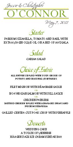
This is roughly what the menus look like
Where are the menus going to be? Like tucked into a napkin?
FutureJOC
Posted:
Member since
Re: Opinions on Table Numbers
Posted by jilliibabii
Posted by FutureJOC
Ok another option (thank to Weezy )
I added the monogram on the bottom of this one and made the number bigger.
Now, the only thing I want to mention is that I am also using our monogram on the top of our menus so I don't want it to look like overkill to use them on the table numbers as well... although I may just be looking too much into it and it really doesn't matter, but I will let you girls decide that LOL
So let me know what you think of this one.
EDIT: I should also mentioned these will be in 5x7, possibly black frames.
I like it and agree that it needs something on the bottom, but I don't know about the monogram. I think it might be too much. What about shifting the sunflower down the the lower left corner and doing the monogram at the top? Or just stretching the sunflower image so it reaches from top to bottom and making the number even larger?
I tried it with the monogram on top and it was working out... here's the one I did with just the flower and the number (both in color and b&w like you suggested) but it looks funky to me
do you think using the monogram in both places is too much or you think it's fine? I'm so anal with stuff like this I swear LOL
This is roughly what the menus look like
Where are the menus going to be? Like tucked into a napkin?
yes
Tetelove
Posted:
Member since
Re: Opinions on Table Numbers
I love number 2...what program did ou use to make your table numbers....
FutureJOC
Posted:
Member since
Re: Opinions on Table Numbers
Posted by Tetelove
I love number 2...what program did ou use to make your table numbers....
Power Point
EDIT: actually everything I am DIYing (table numbers, menus, programs, etc) are all done on Power Point.
halfbaked
Posted:
Member since
Re: Opinions on Table Numbers
Posted by FutureJOC
Posted by jilliibabii
Posted by FutureJOC
Ok another option (thank to Weezy )
I added the monogram on the bottom of this one and made the number bigger.
Now, the only thing I want to mention is that I am also using our monogram on the top of our menus so I don't want it to look like overkill to use them on the table numbers as well... although I may just be looking too much into it and it really doesn't matter, but I will let you girls decide that LOL
So let me know what you think of this one.
EDIT: I should also mentioned these will be in 5x7, possibly black frames.
I like it and agree that it needs something on the bottom, but I don't know about the monogram. I think it might be too much. What about shifting the sunflower down the the lower left corner and doing the monogram at the top? Or just stretching the sunflower image so it reaches from top to bottom and making the number even larger?
I tried it with the monogram on top and it was working out... here's the one I did with just the flower and the number (both in color and b&w like you suggested) but it looks funky to me
I really like the color one. I think that looks best! JMO!