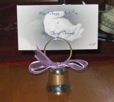
PIC of my very rough place cards
Its very rough. I wanted to see how it looked. Im changing the color to match the ribbon. Just needed to get an idea of the writing.

Search in your own words. Describe what you need or ask a wedding planning question.
Its very rough. I wanted to see how it looked. Im changing the color to match the ribbon. Just needed to get an idea of the writing.
They look great! Would you consider making the table name just a little bigger, or bolder since you are using a script font, it may make it a little difficult to read for the older people or people who use glasseds? Just a suggestion......
Like I said they are VERY rough. I will make them bigger. I wanted to keep the font the same as on my invites so it has some continuity
I love them - very pretty!
Is there a table number on them?
Very pretty! I love pictures of hands - I think it is so romantic.
Very nice, I have never seen any like that before.
Those are gorgeous - I agree with making the table name a little bigger though. :o)
I think it looks pretty!