
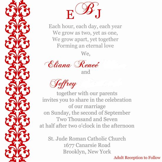
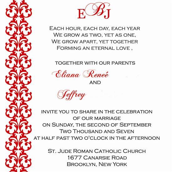
Proof my wedding invitation! Updated with all corrections!
Original post by enjft
For some reason it looks like I wrote 2:30 wrong. Please offer suggestions.
Thanks
Updated with all corrections -
2Be1
Posted:
Member since
Re: Proof my wedding invitation!
Posted by Shorty McBride
I would do: half past two
and change 'invites' to 'invite', and you're golden.
very pretty invite
Ditto
Lola0703
Posted:
Member since
Re: Proof my wedding invitation!
Posted by 2Be1
Posted by Shorty McBride
I would do: half past two
and change 'invites' to 'invite', and you're golden.
very pretty invite
Ditto
I agree but otherwise your invitation is very very pretty!!!!
MrsQ-in2007
Posted:
Member since
Re: Proof my wedding invitation!
I think all the grammatical stuff is covered (I'd also remove the mention of the reception since it's at a reception hall, not a church hall).
I agree that I'd probably put the gray words in a small cap to make it a bit more formal - maybe in Copperplate or Engravers font. Or same font you have but as 'small caps'.
It's a REALLY pretty invite!!!
AllJoy
Posted:
Member since
Re: Proof my wedding invitation!
Very pretty.
hmpena
Posted:
Member since
Re: Proof my wedding invitation!
Posted by ChrissynRicky
I would like to see the monogram on top squeezed in a little tighter.
The only other suggestion is that I'd like to see a fancier font for the text. It's such a gorgeous font used for your names...and I think the other font dulls it down a little. Maybe even putting the other text in small caps?
I agree with Christine. Otherwise, it is beautiful! I LOVE, LOVE, LOVE the colors!
MaureenM618
Posted:
Member since
Re: Proof my wedding invitation!
I do agree with trying to squeeze the monogram together a bit more. Also what about centering your name and his name. It looks a little weird to me because he doesn't have a middle name.
enjft
Posted:
Member since
Re: Proof my wedding invitation!
Posted by MaureenM618
I do agree with trying to squeeze the monogram together a bit more. Also what about centering your name and his name. It looks a little weird to me because he doesn't have a middle name.
His last name is long enough to make up for it
Thanks anyway.
enjft
Posted:
Member since
Re: Proof my wedding invitation! Updated with all corrections!
Thanks for all the constructive criticism.
There will be a little rhinestone between the gap in the monogram.
Please feel free to make further edits.
thanks again!
dawnbridetobe
Posted:
Member since
Re: Proof my wedding invitation!
I see what the other girls are saying about the monogram. Your two initials are actually centered around the 'B' but because of the swash your initial seems further away. Maybe you can overlap the swash with your initial just a bit.
enjft
Posted:
Member since
Re: Proof my wedding invitation! Updated with all corrections!
Posted by dawnbridetobe
I see what the other girls are saying about the monogram. Your two initials are actually centered around the 'B' but because of the swash your initial seems further away. Maybe you can overlap the swash with your initial just a bit.
There will be a little rhinestone by the gap. It will carry out my theme.
Mikeysgirl
Posted:
Member since
Re: Proof my wedding invitation! Updated with all corrections!
It looks like there is one space after your name before the AND, but there are two spaces after the AND before his name. I hope you understand what I mean. You should get rid of one of hte spaces before his name.
enjft
Posted:
Member since
Re: Proof my wedding invitation! Updated with all corrections!
Posted by Mikeysgirl
It looks like there is one space after your name before the AND, but there are two spaces after the AND before his name. I hope you understand what I mean. You should get rid of one of hte spaces before his name.
Got it.
Thanks
qtdimps23
Posted:
Member since
Re: Proof my wedding invitation! Updated with all corrections!
very pretty...i would just make the block wording alittle smaller and make your names bigger so they pop out.
MrsQ-in2007
Posted:
Member since
Re: Proof my wedding invitation! Updated with all corrections!
Posted by enjft Updated with all corrections -
I think it looks great! I like the gray color ink a little better because it's different than the usual black ink - maybe do this invite but with the same color as the original?
Also, I think you could go with one point smaller text for the small caps and one or two points bigger for your names - just so they pop more.
ETA: also, the spacing where your names are and the 'and' is not centered correctly - there is less space between your name and the 'and' than there is between the 'and' and his name.
Looks great though!
Mikeysgirl
Posted:
Member since
Re: Proof my wedding invitation! Updated with all corrections!
I also think there should be a period after the line Forming an eternal love. Otherwise it reads like Forming an eternal love, Together with our parents. Also I think there should be a comma after Yet Together
MrsQ-in2007
Posted:
Member since
Re: Proof my wedding invitation! Updated with all corrections!
Posted by Mikeysgirl
I also think there should be a period after the line Forming an eternal love. Otherwise it reads like Forming an eternal love, Together with our parents. Also I think there should be a comma after Yet Together
This is a good point, but personally I wouldn't put any punctuation after 'Forming an eternal love'
queenb07
Posted:
Member since
Re: Proof my wedding invitation! Updated with all corrections!
The invite is gorgeous! I love it!! My only comment is to move the accent in Renee to over the first e. Right now it's sort of in the middle.
milana
Posted:
Member since
Re: Proof my wedding invitation! Updated with all corrections!
its so pretty!
donegal419
Posted:
Member since
Re: Proof my wedding invitation! Updated with all corrections!
Eliana,
I love it! I would: 1. get rid of the comma after love 2. and if it's a full mass not just a ceremony, you should specify that.... that can be done just by putting Nuptial Mass on the line before the name of the church.
Elise&Matt
Posted:
Member since
Re: Proof my wedding invitation! Updated with all corrections!